Flow Metrics
ReportsOverview
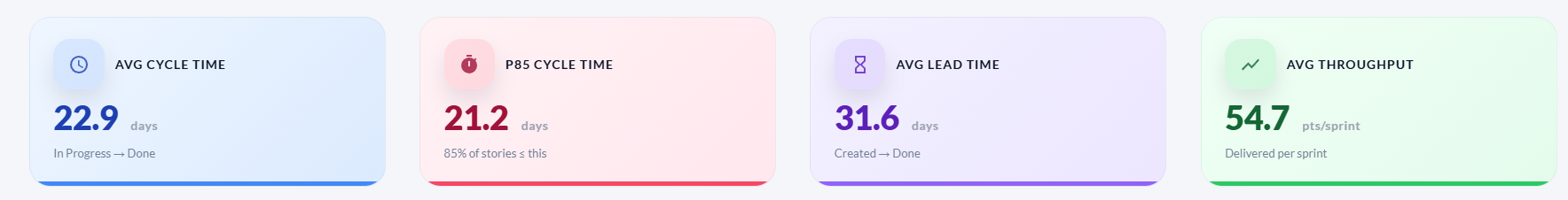
The Flow tab analyses how work moves through the delivery process — how long individual stories take (cycle time and lead time), how much the team delivers per sprint (throughput), and how much committed work is still in flight at the end of each sprint. These metrics help identify bottlenecks, set realistic SLAs, and spot scope risk early.
KPI cards
| Card | What it shows |
|---|---|
| Avg Cycle Time | Average days from a story moving to In Progress until it is accepted/closed. |
| P85 Cycle Time | 85% of stories complete within this many days. A useful SLA target for planning. |
| Avg Lead Time | Average days from story creation to acceptance — includes wait time before work starts. |
| Avg Throughput | Average story points delivered per sprint. Measures the team's delivery rate. |
Charts
| Chart | How to read it |
|---|---|
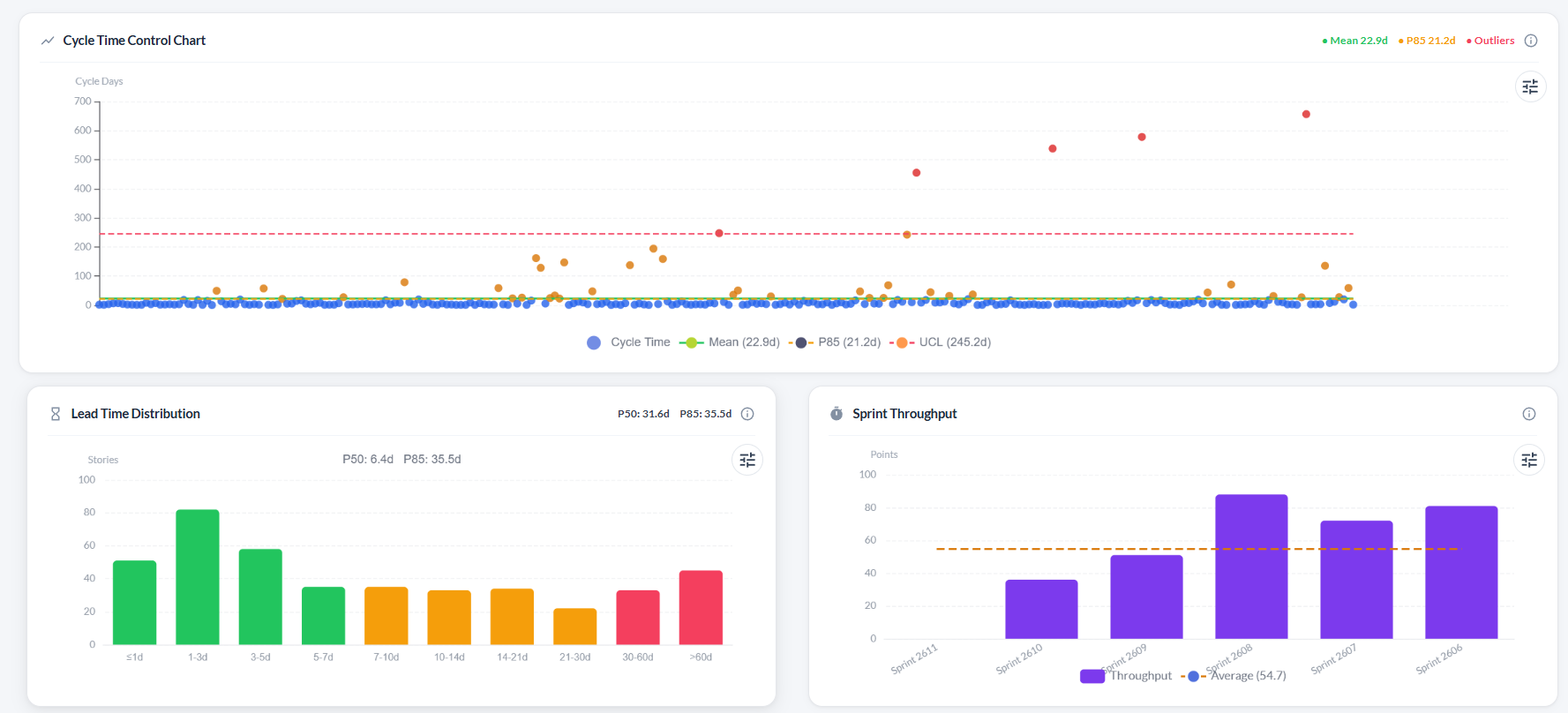
| Cycle Time Control Chart | Scatter plot where each dot is one story. The Y-axis is cycle days. Three reference lines are drawn: Mean (green solid), P85 (amber dashed), and UCL — Upper Control Limit at mean + 3×std dev (red dashed). Dots above the UCL are statistical outliers shown in red. |
| Lead Time Distribution | Histogram grouping stories by how long they took from creation to completion (in time buckets from ≤1 day to >60 days). Bars are colour-coded: green = at or below the P50 midpoint, amber = P50–P85, red = above P85. P50 and P85 values are shown above the chart. |
| Sprint Throughput | Bar chart of accepted story points per sprint with a dashed average line. A rising average means the team is accelerating. |
| Delivered vs In-Flight Work per Sprint | Stacked bar showing delivered points (green) and committed-but-not-delivered points (yellow) per sprint. Tall yellow sections indicate rolled-over work and are a scope risk signal. |
Troubleshooting
The Cycle Time and Lead Time charts are empty
These charts require stories with an In Progress start date and a resolved/accepted date. Stories that were never moved through statuses on the board will not have these timestamps.
Some stories appear as outliers (red dots) on the Cycle Time chart
Red dots are stories whose cycle time exceeded the mean + 3×standard deviation threshold. Review those stories to understand why they took longer — blocked work, large scope, or late status updates are common causes.
The Lead Time histogram has most bars in the red zone
Red bars mean stories took longer than the P85 threshold to complete after creation. Long backlogs with slow triage will inflate lead time. Consider regularly reviewing and assigning backlog items.
Throughput looks lower than the team's velocity
Throughput counts accepted points per sprint. If the team consistently marks stories as "done" without formally accepting them in the workflow, the throughput metric will be lower than perceived velocity.
On this page