Executive Dashboard
ReportsOverview
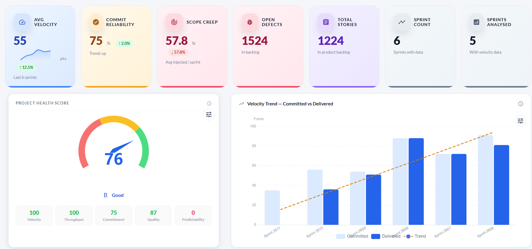
The Executive tab is the first tab on the Analytics page. It gives leadership and project managers a single-screen summary of delivery health — a composite health score, velocity trend, and a per-sprint heatmap that flags problems across four dimensions at once.
KPI cards
Seven summary cards sit at the top of the tab, giving an instant headline view of the project.
| Card | What it shows |
|---|---|
| Avg Velocity | Average story points delivered (accepted) per sprint over the analysed period. |
| Commit Reliability | Percentage of committed story points actually delivered on time, averaged across sprints. |
| Scope Creep | Average percentage of unplanned work injected into sprints. Lower is better. |
| Open Defects | Total unresolved defects in the product backlog. |
| Total Stories | Total user stories in the product backlog. |
| Sprint Count | Number of sprints included in the analysis. |
| Sprints Analysed | Sprints that have completed work and are included in velocity calculations. |
Project Health Score
The gauge chart shows a composite score from 0–100 calculated from five weighted components. A letter grade (A–D) and label (Excellent / Good / Fair / Needs Attention) appear below the gauge.
| Component | Weight | How it is calculated |
|---|---|---|
| Velocity | 20% | Up → 100, Stable → 75, Down → 40. |
| Throughput | 20% | Linear regression on accepted points per sprint. |
| Commitment | 25% | Accepted ÷ Committed × 100. Capped at 100. |
| Quality | 20% | 100 − (defects-per-point × 3). |
| Predictability | 15% | 100 − (injected ÷ committed × 200). |
| Grade | Score range | Label |
|---|---|---|
| A | 85–100 | Excellent |
| B | 70–84 | Good |
| C | 55–69 | Fair |
| D | Below 55 | Needs Attention |
Velocity Trend — Committed vs Delivered
A grouped bar chart showing committed points (light blue) and delivered/accepted points (blue) per sprint, with a dashed orange trend line calculated by linear regression. A rising trend line means the team is accelerating; a falling line means delivery is slowing.
Sprint Health Matrix
A heatmap table that scores every sprint across four metrics. Each cell is colour-coded: green = healthy, amber = watch, red = at risk.
| Metric | Green | Amber | Red |
|---|---|---|---|
| Velocity | At or above team average | Slightly below average | Well below average |
| Commit % | ≥ 80% | 60–79% | < 60% |
| Scope Creep | ≤ 10% | 10–20% | > 20% |
| Defects | Low defect count | Moderate count | High defect count |
Troubleshooting
The Project Health Score gauge is empty
The score requires at least one sprint with committed and accepted points. Create and close a sprint to generate the first score.
The Velocity Trend chart shows only one bar
Velocity data requires multiple closed sprints. The chart will build up as more sprints are completed.
The health grade shows D / Needs Attention but the team feels productive
Check the score breakdown components. A low Quality score (many defects per point) or low Commitment score (significant undelivered scope) often drags the grade down even when raw velocity looks healthy.
The Sprint Health Matrix shows red for all sprints
Each cell is relative to the team's own averages. If the team is consistently below the thresholds (< 80% commit rate, > 20% scope creep), all cells will be red. Use the detail to identify which specific metric to improve.