Organization View
ViewsOverview
The Organization View gives you a single page where you can see the health and delivery status of your entire company — from the top-level organisation down to individual projects and development branches. It's a read-only dashboard, designed for managers and team leads who need to spot risks and track progress across multiple teams at a glance.
Click any node in the left-hand tree and the charts and metrics on the right update instantly to reflect that part of the organisation.
Getting there
Two ways to open the Organization View:
- Click Views → Organization View in the left sidebar
- Open Project View from the sidebar and switch to Dashboard Mode using the toggle in the top-right of the page
Page layout
The page has three zones:
- Summary cards — a row of six KPI tiles across the top showing headline numbers for the selected scope
- Tree + Charts — the left side holds the organisation tree; the right side shows charts and metrics for whichever node you've selected
- Insights rail — three cards along the bottom surfacing delivery risks, recent activity, and an AI-generated insight
Summary cards
The six cards at the top always reflect the currently selected tree node. If you've selected the company root, they show organisation-wide totals. If you've drilled into a single project, they show that project's numbers.
| Card | What it shows |
|---|---|
| Projects | Total number of projects in the selected scope |
| Branches | Active development lines under the selected node |
| Stories | Total stories with completed count shown as helper text |
| Story Points | Total scope in story points across all open work |
| Completion | Percentage of stories delivered |
| Oldest Story | Age in days of the oldest open story — flags aging risk |
Some cards hide automatically when they aren't relevant — for example, the Projects card is hidden when you've selected an individual project node.
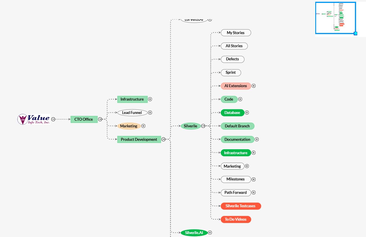
Navigating the tree
The left panel shows your organisation's hierarchy: Company → Departments(Business Entities) → Projects → Branches. The tree loads two levels deep on first open; deeper levels load as you expand nodes.
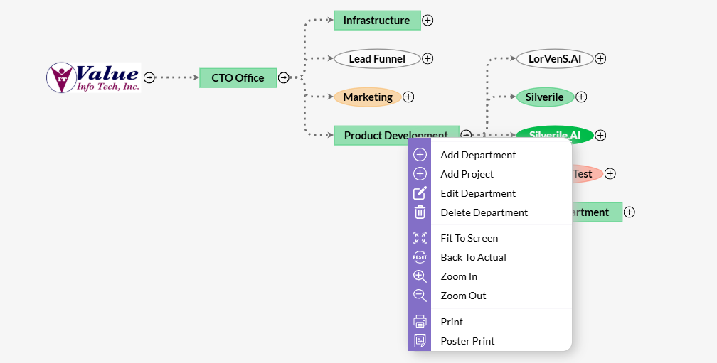
Selecting a node
Click any node to select it. The summary cards, charts, and insights rail all update to show data for that node and everything beneath it.
Expanding and collapsing
Click the chevron (▶ / ▼) to the left of a node name to expand or collapse its children. A spinner appears briefly while child nodes load.
Searching
Use the search box at the top of the tree panel to filter by name. The tree updates in real time as you type. Clear the search to restore the full hierarchy.
Resizing the tree panel
Drag the handle between the tree and the charts area to resize the panel. You can also use the + and − buttons to nudge the width, or collapse the tree entirely with the arrow button to give more room to the charts.
Health indicators
Every node in the tree shows a coloured dot indicating its current health. The selected node also shows a named health badge in the header on the right.
| Status | When you'll see it |
|---|---|
| Healthy | Stories are being updated regularly, nothing is overdue, and no stories have been sitting open for more than 14 days. |
| Watch | Oldest open story is over 14 days old, or there has been no activity in the last 7 days. |
| At Risk | More than 3 stories are blocked, there are overdue stories, or the oldest open story is over 30 days old. Pulses red to draw attention. |
| No Data | No stories exist under this node yet. |
If a node has children that are At Risk, a small triangle alert icon appears on the parent with a count — so you can spot buried problems without expanding the whole tree.
Hover the health badge on any selected node to see the specific reasons driving its status.
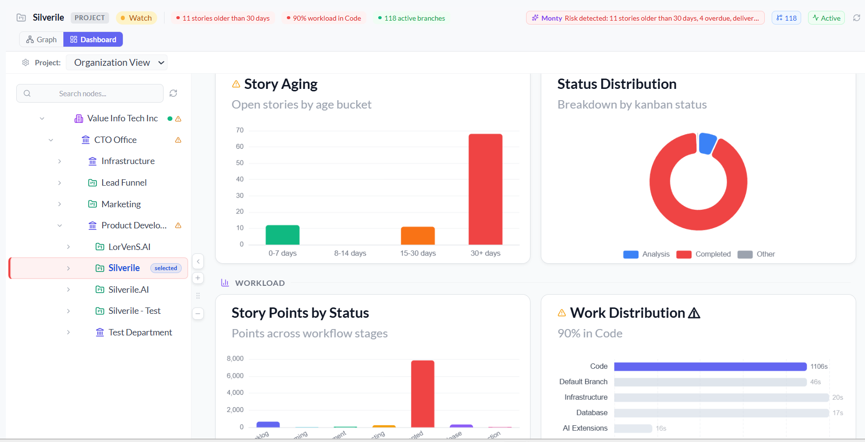
Charts
Six charts are organised into three sections. All charts update when you select a different node in the tree.
| Section | Chart | What to look for |
|---|---|---|
| Delivery Health | Story Aging | Open stories grouped by how old they are (0–7 days, 8–14 days, 30+ days). Highlighted in red when stories are sitting too long. |
| Delivery Health | Status Distribution | Donut chart of stories across workflow stages — Backlog, Grooming, In Development, Testing, Ready, Accepted. |
| Workload | Story Points by Status | Total points across each workflow stage. Shows where scope is piling up. |
| Workload | Work Distribution | Story load per branch or child entity. Flags a concentration warning if one branch carries more than 40% of the work. |
| Momentum | Delivery Trend | Weekly completed story points over time. Shows whether delivery velocity is improving, stable, or declining. |
| Momentum | Activity Trend | Weekly story update count over time. A flat line here means the team has gone quiet. |
Charts with a problem are highlighted with a coloured left border and a warning icon in the title — red for aging stories, amber for workload concentration.
Insights rail
Three insight cards run across the bottom of the page for the selected node:
- Delivery Risk — highlights the oldest open story, blocked story count, and overdue stories. Shows "No delivery risks detected" when everything is on track.
- Recent Activity — shows how many branches are active and whether the team has made updates in the last 7 days.
- Monty Insight — an AI-generated observation about anomalies in aging, workload concentration, or activity patterns. Shows "No anomalies detected" when metrics look normal.
Project View dual mode
The Project View (accessible from Views → Project View in the sidebar) offers two ways to look at the same hierarchy:
- Graph Mode (default) — an interactive visual map of the hierarchy. Drag to pan, scroll to zoom, click nodes to explore. Great for understanding the structure of a large organisation.
- Dashboard Mode — the same Organisation View embedded here. Toggle to it using the Dashboard icon in the top-right of the page header.
If you have multiple projects, a product selector dropdown at the top lets you switch between them without leaving the view.
Troubleshooting
The tree is empty or shows "No Organization Selected"
Make sure you have at least one project set up and that your account has access to it. Select your company from the navigation to load the full hierarchy.
A node I expect to see is missing from the tree
The tree loads two levels deep by default. Expand parent nodes to load deeper levels. If a department or project is still missing, check that your account has been granted access to it.
All nodes show grey "No Data" health
Grey means no stories exist under that node yet. Once your team adds stories to projects, health status will start reflecting real data.
Charts show "No Data Available"
Click a node in the tree to load its charts. If a specific chart shows no data, that metric (e.g. story points) may not be in use in that project.
I can't find a project I know exists
Use the search box at the top of the tree panel and type part of the project name. The tree filters in real time.